
When it comes to the Brontë sisters, most people are familiar with Emily (thanks to Wuthering Heights) and Charlotte (thanks to Jane Eyre). But Ann Brontë — both the youngest and the shortest-lived sibling — has largely been forgotten by all but the most fervent Brontë completists, even though her second novel, The Tenant of Wildfell Hall, was an instant, runaway success in 1848.

As Constance Grady pointed out in Vox last month, Anne may finally be getting the attention she deserves. “Now, [critics are] wondering if Anne might have been the most radical Brontë of all — and if the second of her two books, 1848’s The Tenant of Wildfell Hall, might be one of the first truly feminist novels.”
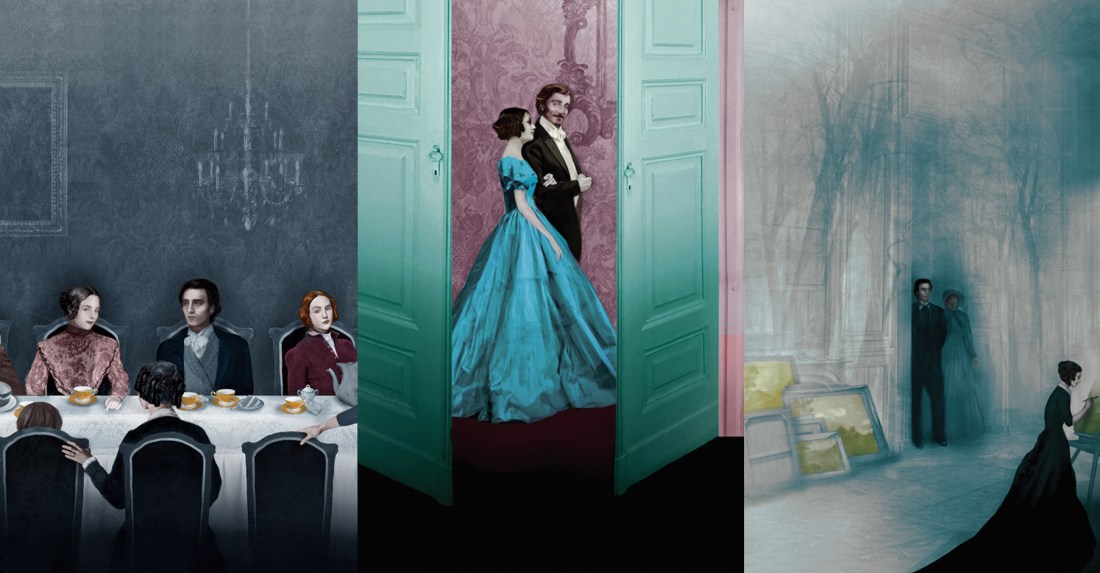
To celebrate the 200th anniversary of Anne Brontë’s birth, and restore her masterwork to its rightful place in the cultural conversation, the Folio Society published an absolutely stunning new edition of The Tenant of Wildfell Hall, including a gorgeous frontispiece and seven color illustrations, along with a new introduction by Tracy Chevalier.
I spoke with the illustrator, Valentina Catto, about how she created a original, visual world to bring Anne Brontë’s characters to life for a new generation of readers.
How did you settle on this particular color palette for The Tenant of Wildfell Hall?
One of the main visual inspirations for the colour palette was the movie the Piano by Jane Campion. I started sketching using exclusively blue, grey and black to convey a bleak and eerie atmosphere and then gradually added other hits of colour.
How did you choose which scenes to depict? Were there always going to be eight?
I was given absolute freedom to choose the scenes that spoke to me the most. It was really hard narrowing them down to eight, because there are just so many incredible ones to choose from, but with the help of Sheri Gee (art director) and Jo Geary (editor) I was lastly able to pick the final eight.
What was your illustration process like? Did you do a lot of historical research on period fashion and interior design?
I normally start every project with a long research and this case was no different, I looked at everything from old pictures to paintings, sketches, costume and interior design, architecture and hairstyles. I’ve tried to find anything that could help me recreate the atmosphere of the time.
How did you decide what each character would look like?
Anne Brontë was very specific in her description of the characters, and while I was reading the book, I could see them very clearly in my head
Were you familiar with the novel before this project? What drew you to this book in particular?
I’m ashamed to say that I had never read the book before starting to work on it. I was familiar with the other Brontë sisters, but never read anything by Anne. Once I had finished reading it I couldn’t believe that I had never even heard of it before! It’s such a powerful book, the main character is one of the strongest heroines ever written and should definitely get more recognition.
What was the most challenging thing about illustrating this book?
This project was particularly interesting for me because my style is usually more surreal, but in this case I had to learn to create a realistic and historically accurate environment for the characters. I was afraid wasn’t going to be able to keep my style and deliver what I was asked for, but I ended up learning a lot in the process and by the end I think I’ve managed to make it work giving the illustration an eerie look that suits the story.
